By Jim Caliendo, President & CEO, PWCampbell
2021’s Top 5 Spring-Cleaning Musts For Your Retail Branch Network
Though the recent pandemic has certainly created an accelerated rise in electronic banking, the branch remains a stronghold in your financial network. According to a recent J.D. Power U.S. Retail Banking Satisfaction StudySM, technology-dependent customers have the highest levels of satisfaction with their onsite banking experiences. Couple that with a direct increase in branch usage for more complex transactions (such as account openings and closings, loan applications, and financial advice seeking) and you can see why the branch is still one of a financial institution’s most valuable assets.
It is just one reason why consistent branding across all channels and customer touchpoints is critical. The branch is a physical expression of your brand – from signage to merchandising to interior design. Each location should look and feel familiar to your customers. Innocent clutter such as scattered tissue boxes and brochures, or drive-through windows pasted with post-it notes, can detract from your brand, and create a negative perception to your consumers.
Do not worry if this sounds like your branch – you are not alone. Here are the top five clutter problems along with recommended solutions to improve your retail space, so you can start delivering a retail branch environment that drives growth and profitability:
BROCHURE OVERLOAD: Displaying old brochures that do not reflect your current branding or fanning out literature on every available surface looks disorganized. Brochure displays that are not calibrated to the correct number of pieces can result in duplicates taking up valuable space. And unbranded, off-the shelf display kiosks or wall racks stick out from the rest of the branded environment like a sore thumb. Especially in a modern-day era where minimalistic design is king, brochure overload can be a huge detriment to your environment.
THE SOLUTION: A general retail principle is that displaying more of a product makes it seem less exclusive and unique. Just picture the difference between displays in a discount supercenter where you can buy tires, socks, and bread in one trip versus a luxury retail store. Create one focal area in your branch to display brochures in branded fixtures – and do not put them out anywhere else. Brochures displayed in a neat, organized fashion appear more desirable and unique to your brand. In addition, going digital ensures consistency across your branches with only the latest versions of your marketing materials on display.
OUTDATED COMPLIANCE SIGNAGE: There’s often confusion over which federal and state regulations actually need to be displayed. Fear of being out of compliance can result in displaying unnecessary, outdated notices. To make matters worse, these pieces are often posted individually on walls, desks and other surfaces for a presentation that greatly diminishes your branded environment.
THE SOLUTION: All in one, 11 x 14 poster frames centralized inside the branch. These frames feature four pockets that allow easy swap outs for regulation changes. The goal is to minimize different sized frames on prominent wall space within customer eyesight. Marketing and compliance teams must also come together to establish optimal placement without too much of a distraction.
FURNITURE FREE-FOR-ALL: In today’s lower-transaction environment, there is often way too much seating for how few customers are actually waiting. Empty chairs look sad, giving the impression that there is nobody in the branch. Mixing design styles is a no-no too.
 THE SOLUTION: Pare your seating back and keep only the pieces that get used on a regular basis or consider investing in new guest seating that leverages your brand personality. Unique, comfortable chairs upholstered in fabric inspired by your corporate color scheme can greatly enhance your in-branch experience. Make sure to keep chairs, side tables, and other occasional furnishings neat and orderly. And nix the residential furnishings – valances, throw pillows, and table lamps are not appropriate for a modern retail environment.
BRANDALISM: Sure, it is nice if your staff feels at home while they are at work. But little Timmy’s T-ball trophy belongs on the mantle, not in the teller area. Personal workspaces decorated with random artwork, pictures of friends and family, sports memorabilia, and overgrown plants express your staff’s individual identities, not your corporate brand identity.
THE SOLUTION: While outlawing these items may be too harsh for most banks, displayed personal mementos should be limited. Consider allowing one or two small items per staff member, placed out of sight from your customers. In our experience, staff is more open to accepting reductions in personal items if they see the financial institution investing in branch renovation, branding, or merchandising.
RANDOM ARTWORK AND PRINTOUTS: When customers enter your branch, you want them to see – and register – messages about your products and services. Intermingling artwork, sculpture, or overly large plants into your space can distract from – and even block – your bank-related merchandising.
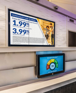
THE SOLUTION: Ditch the Microsoft Word printouts and upgrade your messaging to digital signage. These screens drive an 83% recall rate on messaging – that’s double than traditional marketing methods. Further, it drives a modern perception that your branch is keeping up with the times. If your customers truly appreciate your support of local artists, photography is a wonderful compromise. But consider ways to group photos in one focal area, such as a community wall, as opposed to randomly spread out across the branch. Any artwork that you do have should follow a consistent look and feel. Do not mix and match styles between modern, traditionalism, abstract, photography, and more – it is your job to make sure the branch stays on brand. Leave those versatile displays to the museums. When it comes to greenery, create rules on the maximum number of plants per branch. And set a height limit, for example, nothing taller than four feet high.
Moving forward, audit your locations to see which of these issues are trends, and create rules to eliminate them. Then designate a Brand Champion for each branch tasked with ensuring your new standards are being maintained. The Brand Champion should be someone other than the Branch Manager, who reports back to a senior marketing executive at the main office. It is always a good idea to have marketing or retail periodically visit each branch to ensure that these policies are being enforced long-term.
Follow these steps and we guarantee you will see an improvement in the overall look and feel of your retail branch environment, and the overall customer experience as a whole.
James G. Caliendo is a former bank executive and now President and CEO at the 112 year old design-build and retail services firm. In the past 20 years alone, under Jim’s direction, PWCampbell has worked with over 500 financial institutions influencing millions of square feet of retail and operational space to create engaging, impactful and scalable solutions for every sized facility project.


